




A Logo Is Just the Beginning.
A Brand Identity Is Everything After.

Colors, typography, guidelines, and a visual system that makes your brand recognisable on every surface, every platform, every time.

What Is Brand Identity Design?

More Than a Logo. It's a Visual System.

Brand identity is every visual element that represents your brand — working together as one consistent, recognisable system.
Brand identity design is the process of building a complete visual language for your brand — one that communicates who you are, what you stand for, and why you exist, without a single word being spoken.
It goes far beyond a logo. A brand identity is the sum of every visual decision — your colors, your typography, your graphic elements, your design rules, and how all of them work together across every platform, every product, and every customer touchpoint.
When done right, your audience recognises your brand before they read your name. That is the power of a complete brand identity — and that is exactly what we build.
WHY IT MATTERS?

Your Idea Is Unique. Your Brand Should Be Too.

Every brand has its own story. A brand identity system makes sure that story is told the same way, everywhere.
Every business starts with an idea — and no two ideas are the same. Yet most brands end up looking like they came from the same template. That gap between a unique idea and a forgettable brand is exactly where brand identity design lives.
A complete brand identity system is made up of:

Logo

The face of your brand — built on your story and vision, not your product or service category.

Brand Color Palette

Colors chosen based on the psychological response you want to create in your specific audience — not personal preference.

Typography System

Typefaces that carry the tone, personality, and emotional weight of your brand — making every word feel like it belongs.

Graphic Elements & Patterns

Supporting visual language that gives your brand depth, consistency, and instant recognisability across every format.

Brand Guidelines

The rulebook that keeps every visual decision consistent — whether it's used by you, your team, or an agency five years from now.
Together, these elements don't just make your brand look good. They make your brand feel like something and feeling is what customers remember.
Brand Identity Roadmap

From Your Idea to a Brand the World Remembers

Our transparent brand identity process maps every stage and deliverable, guiding your brand from brief to strategic identity.

Brand Discovery

We learn everything about your brand before we pick up a pencil your audience, market, vision, and the feeling you want to own.

Deliverable:

Brand Discovery Document — the foundation every design decision is built on.

Stage 1

Competitor Research

We map your competitors' visual language and identify exactly what space in the market is still yours to claim.

Deliverable:

Competitor Identity Report — with a clear picture of what's overcrowded and what's wide open.

Stage 2

Mood Board Creation

Three distinct visual directions — colors, typography, tone, and feel. You choose the one that's unmistakably yours.

Deliverable:

3 Curated Mood Boards. No guesswork. No mid-project surprises.

Stage 3

Logo Design

Three fully independent logo concepts each with its own visual approach and design rationale. Not variations. Not shortcuts.

Deliverable:

3 Complete Logo Concepts with full design story. You pick one, we refine it to perfection.

Stage 4

Final Logo Delivery

Prepared for every real-world application screen, print, billboard, or product label.

Deliverable:

All formats (AI, EPS, PDF, PNG, SVG), all color variants, and real-world mockups across 10+ surfaces.

Stage 5

Brand Guidebook

The complete instruction manual for your visual identity. Every rule, color code, and usage standard — so your brand never gets diluted, no matter who works with it.

Deliverable:

Full Brand Guidebook covering colors, typography, logo rules, social templates, corporate applications, and photography direction.

Stage 6

THE FACE OF YOUR BRAND

A Logo That Tells Your Story, Not Your Service.

The best logos in the world don't show what the brand sells. They show what the brand believes.

What Is a Logo?

A logo is the single most visible element of your brand identity — the visual shorthand your audience uses to recognise, recall, and feel something about your brand in an instant. But here is where most brands get it wrong.

A logo is not a product illustration. It is not a service description. It is not a literal representation of what your company does. The moment a logo tries to explain your business, it starts to look like every other business in your category.

Apple sells technology. Their logo is a bitten apple.
Nike sells sportswear. Their logo is a swoosh — a feeling of motion.
Zomato delivers food. Their logo has no plate, no fork, no food reference

What makes these logos powerful is precisely what they don't show. Instead of describing the product, they represent the brand's story, energy, and position in the world. That is what stays in memory.

How a Logo Is Made — The Remorphs Story

The best way to understand great logo design is to walk through a real one. Here's exactly how our own logo was built — step by step.

1. The Brand Name Remorphs

The name itself carries meaning. To remorph means to reshape, restructure, and reimagine. It signals transformation — of form, of perception, of identity.

2. The Story Behind the Name

Remorphs exists to reshape how brands present themselves visually and to change how their customers perceive them. We don't just design identities. We redefine how the world sees a brand.
The core idea: transformation of visual form.

3. Finding the Visual Concept

We needed a symbol that represents something that changes its shape — naturally, beautifully, and over time. The answer was immediate.

The Moon.

The moon is the most universally recognised shape-shifter in nature. It changes form every single day — from a full circle to a crescent to near-invisibility and back again. It is constant in its presence. It is always transforming in its form.
That is exactly what Remorphs does for brands.

4. The Design Decision Remorphs

We took the crescent moon shape and placed it as the letter "O" inside the word Rem"O"rphs. The result: a wordmark where the moon sits naturally in the name — subtle enough to feel like it belongs, distinctive enough to make you look twice.
This is how a logo should be made. This is exactly how we build yours.
Color & Typography System

Colors and Typography Don't Just Look Good. They Feel Something.

Every color triggers a psychological response. Every typeface carries an emotion. Both must be chosen for your specific audience.

The Psychology of Color

Color is not decoration it is communication. Before your audience reads a word, they have already felt something about your brand. That feeling is created by color.

Red

Energy. Urgency. Passion. Appetite.
Red triggers immediate emotional arousal it raises pulse rates, creates a sense of urgency, and stimulates appetite.

Brand Example — Coca-Cola

Yellow & Red

Happiness. Warmth. Speed. Hunger.
Yellow triggers optimism and approachability. Combined with red, it amplifies appetite stimulation and a sense of fast, cheerful energy.

Brand Example — McDonald's

White & Silver

Minimalism. Premium. Precision. Sophistication.
White signals simplicity, clarity, and space. Silver communicates technology, modernity, and high-end quality. Combined, they position a brand as premium without saying a word.

Brand Example — Apple

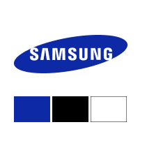
Blue

Trust. Reliability. Calm. Professionalism.
Blue is the most universally trusted color in branding — it creates a sense of security, stability, and confidence.

Brand Example — Samsung

The Psychology of Typography

Typography is the tone of voice your brand uses in visual form. Before your audience reads the words, they feel the emotion the typeface is carrying.

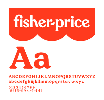
Playful & Rounded Typography

For brands targeting children, families, and joyful experiences.
Rounded letterforms, bouncy baselines, and hand-crafted character communicate fun, safety, warmth, and accessibility.

Brand Example — Fisher-Price

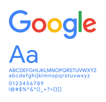
Clean & Modern Sans-Serif

For technology, SaaS, and professional service brands.
Geometric, structured sans-serif typography communicates clarity, intelligence, and modern confidence.

Brand Example — Google

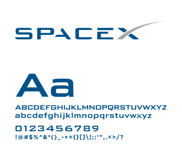
Futuristic & Structured Sans-Serif

For space technology, defence, advanced engineering, and forward-facing innovation brands.
Sharp, precise, and engineered-looking letterforms communicate vision, technical authority, and forward momentum.

Brand Example — SpaceX

Brand Guidebook

Your Brand's Blueprint. For Every Future Creative.

A brand guidebook ensures your identity stays consistent no matter who creates for your brand, now or years from now.

What Is a Brand Guidebook?

A Brand Guidebook is the complete instruction manual for your brand's visual identity. It documents every design rule, every color value, every typography guideline, and every usage standard so that anyone who creates for your brand, at any point in the future, produces work that looks and feels exactly like your brand. Every time.
Without a brand guidebook, your identity is at the mercy of interpretation. Every new designer, every new vendor, every new social media manager makes their own decisions and slowly, your brand drifts. Colors shift. Fonts get swapped. Spacing rules get ignored. The brand that once felt sharp and consistent begins to look assembled from different sources.
A brand guidebook ends that permanently.

What a Brand Guidebook Contains

Color System

Every color in your brand palette — Primary, Secondary, and Accent — documented with Hex, RGB, CMYK, and Pantone codes. Usage rules for digital and print applications.

Typography System

Primary and secondary typefaces, usage hierarchy, sizing guidelines, line spacing standards, and rules for headings, body copy, and captions.

Logo Usage Rules

Permitted uses, prohibited uses, minimum size requirements, clear space rules, and all approved color variations — full color, reversed, black, and white.

Brand Graphic Elements

Patterns, textures, icons, and graphic devices that support the logo and appear across all brand materials.

Social Media Guidelines

Post templates, profile image rules, cover photo standards, and visual guidelines for every major platform — so your feed looks like one cohesive brand, not a random collection of posts.

Corporate Application Examples

Letterhead, envelope, email signature, presentation template, business card, ID card, and branded stationery — all designed and documented.

Photography & Imagery Direction

Visual style guidelines for photography — subject matter, tone, color treatment, and composition — so every image your brand uses feels like it belongs.

Why It Matters for Your Brand's Future

Every time your business grows a new team member, a new agency, a new product launch, a new market — your brand identity needs to be applied somewhere new. The brand guidebook is what makes that expansion consistent and seamless.

Social media posters. Ad creatives. Brochures. Packaging. Exhibition stands. Merchandise. Every future creative your brand ever produces will look like it came from the same source because it did. The guidebook is that source.

This is how brands scale without losing their identity.
SEE IT BEFORE IT SHIPS

Your Brand, Placed in the Real World Before It Launches.

Real-world mockups show exactly how your identity performs across every surface — before a single item is printed or published.

Mockup Applications We Deliver

Ready to See Your Brand in Motion?

*Free. No sign-up. Just the conversation your brand needs.

Brands We've Rebuilt from the Inside Out

Customer Reviews

What Happens After Working With Remorphs

Contact Us & Get a Quick Quote

Tell Us About Your Brand. We'll Build the Quote.

Every quote is specific to you no generic pricing, no hidden costs. Share your details and we'll respond within 24 working hours.

Why Brands Choose Remorphs

AI-Generated Output

Every Deliverable Is Professionally Refined

Creative Inputs From Our Side During Work

Best Quality At Best Price.

FREE Revisions Even After Work Tenure Ended

(T&C Applied. Read Our Privacy policy )


    Choose Your Required Service*


    Top